Thursday 31 January 2008

Laziness breeds creativity

Connection, Stavanger, January 2008

Tonight I had every intention of getting out and about in Stavanger with my pocket camera. Then the air turned chilly and damp. I lost my motivation, instead opting for the warmth of the hotel room. I then started to look around me and decided to have some fun with strange landscapes not more than a couple of metres away. Here are some of the results. There truly are photographs everywhere.

Entry, Stavanger, January 2008

Lamp, chair, Stavanger, January 2008

Ventilation, Stavanger, January 2008

Coffee Mountain, Stavanger, January 2008

Wednesday 30 January 2008

Familiarity and heightened perception

Spartan: the loneliness of the business traveller, Stavanger, January 2008
Inspired by Doug Stockdale's
Insomnia: Hotel Noir series

So I'm back in Norway (Stavanger) for the week - first time back in four years (thereabouts). It's all so familiar (even the work, which is follow-up to stuff I did just before I left).

This had me thinking about the nature of perception, the relationship we have with the familiar (in general) and the relationship I have with my surroundings as a photographer. Let me explain.
This is actually the first time in a while that I've returned to a location after a long time away, certainly the first time since I seriously got back into photography. One thing I have been noticing are the little details - e.g. walking out of the wrong door of the airport because they've restructured the interior. When so much is familiar, the small differences stand out. I am unsure, though, as to the source of my observations. Is this simply the fact that one does notice small differences amongst the familiar? Or is it something more fundamental to someone who looks at the world photographically - constantly noticing small things, thus more likely to observe the differences? On a personal note, have I really got that degree of sensitivity to the world around me that it would be the case?

No answers but plenty to ponder over a beer of an evening.

Monday 28 January 2008

Lightzone ZoneMapper: a primer for curves users

As I mentioned before, I intend to write some posts on editing techniques in Lightzone. Not really tutorial, more handy hints and things I've picked up along the way. I hope it will be useful to users of other editing tools who may be considering Lightzone.

As a start I thought I'd start with the central tool in Lightzone, the ZoneMapper. I came the the realization that without an introductory post like this, any other post would be excessively long. This is a mixture of an introduction of those new to Lightzone but more specifically a comparison with curves from other tools (I've used Picture Window Pro) about achieving the main results.

getting to grips with the ZoneMapper is IMO essential to getting the most out of Lightzone. It'll also be at the heart of many of my other posts in this series, and I'll refer back to this one when I do.

So to start with basics.

Introduction

I won't go on about the zone system, tonal values and all that. Quite frankly I find it confusing and unhelpful. I'm going to stick to a practical description based on visual perception: it's the way Lightzone is designed to work and should be understandable to all.

The ZoneMapper is a tool designed to make visual adjustments to the tonal balance of an image. To my mind its power lies in two features: the simple, can't-go-too-far-wrong interface and the tie-in to the ZoneFinder view that allows easy identification of tonal ranges.

It needs to be noted that the divisions are exponential. The documentation says that each division represents 1/2 stop of exposure, in practice I find it easier to think of each division as 1-bit in a 16-bit system. Each is roughly equivalent.

Another thing to note is position locking. When a zone boundary is selected it is locked in place until moved. This makes it possible to isolate the range to be adjusted in a way that is difficult with curves. In Lightzone 3.2, this can be combined with the colour/tone range selector for very fine control of the range of application without the need for masking.


Anatomy of the tool

First to show what the elements are. At the top of Lightzone's tool stack is the sample window. It can show the ZoneFinder, a Colour Mask (more of which below), a histogram or a cursor sampler. Each of the first 3 gives data on what is currently visible in the edit window. The yellow highlight in the ZoneFinder pops up when the cursor is hovered over a zone boundary. This shows the areas in the Zone immediately above the boundary.
It is important to note at this point how the ZoneMapper works at a pixel level. While the ZoneFinder shows whole areas in a given zone, this is a broad average, the ZoneMapper actually affects all pixels at a given pixel value. The extreme would be a series of dark and light stripes. While the ZoneFinder might show a mid-range zone, the actual pixels are a high end and a low end. The ZoneMapper will treat them at the pixel level as high value and low value, not their zone average.

Below the main zone selector are 2 tabs, one for the normal blending options, the other for colour masking (see below).

Brightening: Upward movements

This is quite straightforward. Take a zone marker and move it upwards. This is directly equivalent to generating a 3-point curve above the central line.

Moving a zone all the way to the top is the same a curve locked to the top edge or input values in a levels tool.

The white point

White point can be moved by moving the top zone marker. This is equivalent to locking a curve to the right edge or the output value in levels.

Darkening: Downward movements

The opposite of brightening: take a zone marker and move it down. Equivalent to curves below the central line.

Taking a zone marker all the way to the bottom is equivalent to locking a curve to the bottom edge or lower input value in levels.

The black point

As with white point, the black point can be adjusted by moving the bottom zone marker up: left edge in curves or lower output value in levels.


Contrast adjustments

This is where the real power of tonal tools shows through. By taking two zone boundaries and moving them apart (lower one down, upper one up) contrast is enhanced for the range in between.
Moving them together reduces contrast.

The big difference is that in ZoneMapper it is not possible to do whacky things like this:

because the zone markers can never be overlapped.

Locking zones

One thing that s particularly good about the ZoneMapper is the ability to lock a zone boundary and only make adjustments on one side or the other (or both, independent of one another). Doing similar in curves takes a lot of adjustment points.

Colour masking (for version 3.x)

In the current versions of Lightzone there also exists the ability to mask each tool by colour/luminosity range. This is useful if e.g. you only want to do mid-tone adjustments with control on the definition of mid-tone. The 4 little arrows at the bottom show this in action. From the left the arrows are: dark feather limit, dark feather start, light feather start, light feather limit. Here I've shown the Colour Mask window which shows the mask in effect for the current tool. The 3 little RGB dots show there is a colour mask in effect for that tool (normally they're orange).
A quick note on RGB versus Luminosity

There are 2 ways to employ the ZoneMapper - luminosity only or on RGB. The first is the normal way to use it, keeping RGB relations in tack. The RGB performs the adjustments on each channel separately. I can't remember ever needing RGB setting.

So there it is, I hope that proves useful.

Sunday 27 January 2008

A moment frozen in time

Preparing for the start, London, July 2007

This week's masterpiece (after last week's Renoir) was Rembrandt's "Nightwatch". If you've never seen it in the flesh, I can recommend it for the experience - I'm not sure I've ever seen a painting with such presence, a combination of its reverential position in the Rijksmeusem, it's sheer size and the quantity of visitors it attracts.

Today's interesting observation, however, was about the way the event has been captured. For the time (1642) it was a rather ambitious (even daring) move to depict such a group portrait in this way and technically innovative to imbue such a sense of motion to the picture (a signature of Rembrandt's style). It was stated in the TV programme that this captures a specific moment in time, just as the group were setting off. As viewers we arrive at just the right moment, any earlier and nothing is happening, any later and they are away.

This is Cartier-Bresson's decisive moment captured some three centuries before he coined the phrase, coupled with an almost photographic sense of dramatic lighting.

I distinctly got the feeling that Rembrandt was working within the limits of medium unsuited to his vision. If he were alive today, I think he would be a great photographer - a medium with which he could fulfil his vision to its greatest potential.

Lightzone 3.2: a look at printing

Now that I've got my printer back in action, I decided to take a run at printing from Lightzone 3.2. I'd previously tried from 2.4 but there were so many issues (not least a weird corruption of the right edge of images) that I gave up long ago.

So I started out to run off a couple of the recent set I've been doing for my up-coming print review. I loaded up one of the pre-prepared jpegs: correct size, white border. di a couple of contrast adjustments and set it to print. And then waited (and waited and waited) then went off to do something else. It took over 5 minutes to process the image to the printer - all in the foreground. I have no idea what was going on but it wasn't a processor or memory limit. Once that one printed i tried another to see if it would be quicker. Nope.

Another one of those annoying quirks that's getting in the way of this being a great piece of software.

Needless to say, I will into be printing any more from Lightzone 3.2 - I hope the new version (3.4) is in better shape.

Friday 25 January 2008

Getting to grips with black point

Lake hut, Mongolia, September 2006

Over the past couple of days I've been putting a lot of effort into printing. Now I've got my printer working again, there is quite a back-log. I'm also putting together a series of prints for a print review session at an up-coming workshop. It's been quite a trying experience at times.

i realised that I had to put together a more robust workflow for printing than I had, plus most of my print optimization had been in preparation for the local print shop. Different printers, different final edit.

I always work my output (web, print, distribution CDs) from a 16-bit TIFF exported from Lightzone. I had to make a few changes to the settings there. Black point needs to be set high enough in the TIFF to cover all outputs (e.g. my printer has a black point of around 35). Then the image needs some levels & contrast adjustment to get the blacks (and sometimes whites) in the right place. As I pay more attention I'm finding more and more I need to do to get it just right.

Then there are the printer settings. I ran through about 10 sheets of awful prints before realising I'd set colour management in both Photoshop and the printer. The iP6700D (and I'd presume other Canon printers) has an annoying pre-sets function where output settings are stored. It's fine if you stick to the setting saved but make a change and everything else seems to revert to default. I had to go carefully through each of the pre-sets I use to make sure they were all just right Plus you can't modify & re-save the settings, need to create a new set but at least the old filename can be overwritten.

The outcome of all this is a dramatic improvement in the quality of prints I'm putting out, more consistency and a much easier process to boot. Next I'll need to start trying Fine Art papers, now that I think I can cut down the wastage.

Finally some sense from Canon

If you're not aware, PMA08 is on it's way - the big US photography show. There's a whole host of announcements but for me the most significant for me are from Canon. Why? Less megapixels. While everyone else is scrabbling for the 10, 12, 14MP pocket cameras, the latest from Canon are all in the 7-8MP range (even the new DSLR is restrained at 12MP). Hoorah! Finally an emphasis on image quality rather than marketing hype.

Couple that with the good reviews of the G9 and it looks like Canon are really pushing their photographic (as opposed to consumer electronics) credentials in the small camera market.

Monday 21 January 2008

Back to printing

I've been preparing quite a few files for printing. I've not put any images to paper for months and thought it was about time. I also got my printer back in working order.

My printer is the cheap, but decent quality output, Canon iP6700D (Photo-i review) a six ink consumer level A4 printer. Not flash but gets the job done. When properly controlled, the output can look very nice, even for black and white. Unfortunately it stopped working a while back as it couldn't recognise one of the ink tanks despite it being original canon supply from a reputable store. canon's answer was to send it back to them. I never got round to it. This weekend I decided to buy a replacement for the offending tank: bingo, it worked first time. Annoying but fixable. Now I'm back in service.

It's taken a while to tweak my printing workflow to match my updated processing workflow. I've spent quite a bit of time determining the black point for the printer: a whopping level 35. That means levels tweaking for most images. That done, I had a job tweaking black and white output to get the right tonal range and balance. First mistake was to try printing B&W as colour - can you say "colour cast"? In-built greyscale is the way to go, nice neutral tones. Colour images are fine, settings just off those I used previously. Save both set-ups as in-built profiles and I'm away.

As to colour profile, I'd reset that using the Monaco EZColor kit that came with my Epson V750 scanner. Once the scanner is properly profiled you can run a test print and use the scanner & software to profile the printer. That's a good reason to go with the V750 versus the V700.

The value of Art

Sunday on the Square, Seville, November 2006

This morning I watched a TV programme about Renoir's "Le Bal au Moulin de la Gallette" which had some interesting observations about Art in general. It put me in mind of discussions at the Landscapist (I link the discussions there a lot because I find them interesting, particularly as a departure from most of the rest of what I read about photography).

Renoir was quoted as saying: I paint pretty pictures. Yes, pretty. There was the usual line up of art critics to deconstruct as to why it is enjoyed as a pretty picture. Interestingly, they avoided seeking further meaning. (Renoir admitted and declared he was not an intellectual painter.) Maybe this was in light of the artist's declared intentions.

What also struck me was the lack of acceptance of the technique at the time. Impressionism and its soft light techniques are now well estalished but at the time were not well received by critics who did not understand the new style.

The smaller version was sold as one of the most expensive paintings ever ($70million). One of the commentators said all works of art have an element of the decorative and of the commodity. This price sent this picture more towards the commodity aspect (it was then locked in a climate controlled vault). It is unfortunate for Art but is an inevitable (IMO) result of it and other great works being held up as the greatest examples. Critics cannot elevate certain works to the highest heights and then bemoan the extraordinary prices they command.
At the time Renoir declared that he was likely to lose money as a result (actually the large version was sold and now hangs at the Musee d'Orsay in Paris). It has something of the feel of the artist creating a landmark work to make his name (not always a successful ploy).

I was struck throughout of the parallels between the discussion of this work (and Renoir in general) and how it was perceived contemporaneously with current discussions surrounding photography, its place in the art world and the pricing of prints. Plus ca change.

Sunday 20 January 2008

SoFoBoMo: the preparations

As this idea has stemmed from the NaNoWriMo, an important aspect to bear in mind is the community feel. There is the notion of participants supporting one another in their efforts throughout the month. In that spirit, I'm going to post about my efforts along the way - comments & help are encouraged. Until April, it'll be a few posts on preparing but hopefully a lot of posts through the month to capture my process and thoughts.

First up is the whole idea of preparation. I reckon there are a few basics that I need to get straight before I start the whole thing.

Subject: I want to present something fairly cohesive along a theme. A novel rather than a collection of short stories. Obviously it also needs to be something that can be put together in a short space of time. I pretty sure now what i want to do based on an idea that came to me reading Dave Beckerman's recent posts on grain elevators (although my subject will have absolutely nothing in common with that). It's also an opportunity to experiment a little.

Place: this is tricky. I have no idea what work I'll be doing (day job) or what travel I may have to do so I need to have enough flexibility to shoot anywhere. Usually I play off this uncertainty to widen my thoughts but SoFoBoMo will need a little more certainty given the time pressure.

Publishing: I'm going to have to learn the mechanics of putting together a book in PDF format. that means finding some software that will allow me to do the job without forking out $500. No Adobe InDesign for me. The mechanics of this bit need to smooth so I don't need weeks of fighting the computer - that's against the whole spirit.

Medium: as I shoot in a variety of formats I need to nail it. I'll stick to the DSLR - I'm very comfortable with it and it gives me speed and flexibility. I envisage needing to take a lot of exposures to get 35 images together. I'm actually going to target 50 to make sure I do get 35. I think I'll abandon my initial thoughts of 1 roll, 1 afternoon as I did with my bicycles theme.

Saturday 19 January 2008

SoFoBoMo is go

What's that tongue twister? The Solo Photo Book Month. Read about the launch here. Kudos to Paul Butzi for putting this together, I think it's going to be a great project. Needless to say, I'm signed up.

Considered randomness

Thicket, Wiltshire, December 2007

Following on from the discussion at the Landscapist about apparently random photography, I've been looking at (and comparing) quite a number of landscape photographs. I've been looking at the distinctions between the traditionally composed images, especially "Grand Scenic", and more intimate work. Some of the latter has a distinctly composed feel, some has that air of randomness.

What this came to was thought on what made the seemingly random into good photography (there's also a lot of really random rubbish). For me it came down to a balance of elements with no distractions. let me explain. Often when I look at photographs, my own included, I see distracting elements, especially around the edges that draw the eye away from the subject. Removal of these is central to my cropping philosophy. The good shots have an even balance. there is also, though, a distribution of large and small elements, lines that lead this way and that and a depth to the subjects that passes beyond mere foreground-background or careful layers.

This balance of elements - the lack of distraction, the large and small and a sense of depth - are then, for me, the things that make the seemingly random into good photography. Of course, to produce such work consistently (I'm ignoring the luck shot) requires a good eye for detail and careful though about composition. Just like any other good photography.

This working of these elements into good images is what I have dubbed "considered randomness". It is, for me, one of the strongest yet hardest to create forms of photography.

Time I tried ColorNeg

Bratton Church from Combe Hill, Wiltshire, December 2007

After Colin Jago's positive experience, now Colin Griffiths has taken it up (along with large format photography). Looks like ColorNeg is something to try for colour negative scanning. I'm already getting good results for black and white with a scan as positive approach but colour is a little more resistant to simple workflow and I'm not entirely happy with the results from Silverfast AI in negative mode.
Even if the ultimate output will be monochrome (from colour film) a good colour conversion is needed to start with. It should help with my scanning of some of my old film, too, for which Silverfast doesn't have a profile anyway.

Friday 18 January 2008

Portfolio updates

Having put together quite a lot of new material and reworked a few old images, I've updated my portfolio page. The main change is the addition of a new portfolio collection for my developing series on Wiltshire.

I've also corrected a few of those I had already posted for proper colour space and some sharpening tweaks.

Wednesday 16 January 2008

A category for Lightzone

Having posted quite a bit about Lightzone, coupled with the fact that I get quite a few search hits, I've collated all of my Lightzone stuff into a new category (find it over on the right).

I'm also going to start an intermittent series on Lightzone suggestions based on handy processing techniques I've discovered. I'll try and make each post thematic. Where I know it, I'll be mentioning equivalents in Photoshop and software with similar workflow.

As I run Lightzone versions 2.4 and 3.2 I'll be referencing techniques in both.

Tuesday 15 January 2008

Call for sense in the camera market

dpreview have posted their pre-PMA predictions, mainly as a placeholder for their page for PMA coverage.

The best part, for me, are the calls to manufacturers at the end of the list:


  • Fewer pixels please (we care about image quality) - It's a straightforward
    prediction that we'll see fourteen megapixel compacts at PMA, which in our
    opinion will be yet another step back for image quality. Other than subtle
    improvements in image processing overall image quality in compact digital
    cameras hasn't improved since the six megapixel era, to make things worse the
    marketeers have decided that high sensitivity will sell compact cameras. There's
    simply no worse combination than tiny photosites and high gain. So we'd be happy
    to pat any manufacturer on the back who delivers improvements in overall image
    quality without the obvious step in megapixel count (great high ISO performance
    will be a natural consequence of larger photosites and/or larger sensors).
  • Shelf stuffing - Lastly, please, lets move away from the practice of 'shelf
    stuffing'. That is producing four or five product variations on the exact same
    model with very subtle differences (such as LCD screen size) with the intention
    of getting more shelf space for the brand. It's counter productive as it only
    leads to confuse the consumer and in these days of online purchasing the gains
    of such practices must surely be questionable.

Yes, please. More of that.

Reworking old material (revisited)

After Kjell Harald's comments on my earlier post, here (hopefully) is a better demonstration of the improvements in the workflow. These are 100% crops from an 18" print file (about a 2:1 enlargement of the original). I've also tweaked the images so that they more closely resemble on the screen what would be seen in the print.

Images close to print (original on left, new on right):


100% crops from various areas (original on left, new on right):


The second set of crops I think shows the difference most clearly - more subtle colour, tone & detail.

All of the extra detail is noticeable in a print even at reasonable viewing distances.

Monday 14 January 2008

Blog reaches 5000!

Sometime this afternoon my counter sauntered past the 5000 mark. It amazes me how a small blog in a crack at the edge of the interweb can reach so many people in so many places.

Thanks for reading and please, keep coming back.

Reworking old material

As I've been working through my Wiltshire series I've been working on a couple of improvements to my workflow. The first is about using black and white to work on tonal adjustments (as I mentioned here) the second is a more refined local enhancement. The latter is revealing more detail in images and yielding some that require no output sharpening at all. I'll probably go into more detail in this at another time.

As for now, I decided to go back to one of my favourite shots of the last 12 months but one that did not print well.

Fallen tree, Stourhead, April 2007

Here is the original I created. Too dark, a lot of detail lost and a really disappointing print. I do, however, really like the subject and composition.

So I decided to put my new workflow to the test, including more advanced sharpening. Here is the result.

Fallen tree, Stourhead, April 2007
This is now the 4th incarnation


This is much improved, it enlarges well, retains far more detail and should result in a great print even at 18".

Saturday 12 January 2008

Rapid autofocus: expectation too far?

With the birth of the new super-Nikon (the D3) and the problems reported with the competition (Canon's 1D mkIII) I was given to pausing for thought.

2 things sprang to mind. First up: will the Nikon be flogged through similar tests to see if it lives up to expectation? Or are no sports shooters going to touch it? That's really an aside.

The second point though relates to the expectations we now place on technology versus some of the practicalities of making that happen. it seems to me, in all the brouhaha that no-one stopped to think if it was even possible for the Canon's autofocus to work under the rapid fire conditions. I will use this as an example but there are more and more instances of this sort of thing. I'll explain what I mean.

So, the 1D mkIII can shoot at 10 fps (frames per second). It does this onto a 10MP sensor of 19x28mm. That's pretty small sensors allowing for some close pixel peeping. Meanwhile the autofocus is supposed to keep up. In 0.1s the camera must do the following (starting from previous shot):
  • Lower the mirror
  • Settle mirror in place
  • Acquire target
  • Focus lens
  • Lock focus
  • Determine exposure (assuming AE)Raise mirror
  • Release shutter
The focus part is a tiny fraction of that tiny fraction of a second. It requires a control feedback loop to close (actual open loop on Canon cameras) and a mechanical device to move. This all takes time.

There is then the issue of accuracy. All autofocus systems work within a tolerance of acceptable focus. I believe for Canon this is defined as 1/3 the depth of focus range for the lens wide open. That translates to approximately 1/3 the depth of field for mid-range targets (not exactly, I know but I'm illustrating a point). With a 300mm f/2.8 lens at, say, 50m (DOF +/-1.5m) that's about 50cm tolerance. If the subject is moving slower that 5m/s (50cm/0.1s) then the AF may do nothing at all.

So we now have a situation where the entire system has to focus more accurately than before, on smaller increments of subject movement in an ever shorter time-frame. However, the manufacturing tolerances in the system haven't moved.

I've not even mentioned the issues surrounding getting the mirror back into place. That means any vibration or movement of the bumpers the mirror sits on, or expansion through heating has to be factored in.

I'm specifically trying to prove anything about the particular AF issue, just pointing out the many factors that go into determining if we might expect the results predicted/sold.

At some point we have to get realistic about our expectations. As an engineer part of my job is to try and determine if a solution is feasible or if we can work within the range of expectations in real-life conditions (not just in a controlled lab). That means thinking about some of the principles of the device and it's capabilities and figuring our if all the marketing hype approaches what might be expected. Claims for cameras are starting to quickly diverge from the bounds of feasibility, in my opinion and we need to look more critically at claims before even testing them.

It's all about viewpoint

Gathering Clouds, Wiltshire, December 2007

This appears to be a wide-open, deserted field. Great views for miles. this was taken as the sun fell and clouds rolled in from the West (right of picture). About half and hour later it was pouring with rain.

The shot below was taken about 20 yards away and about 2 minutes later looking in the same direction. Explains why it's so deserted.

You have been warned, Wiltshire, December 2007

This is actually a view over the MOD's Imber Ranges, part of the Salisbury Plain training grounds. The thump-thump of heavy artillery in the distance was a regular feature of growing-up for me.

What we photograph is all a matter of where we stand and which way we look.

Thursday 10 January 2008

Influence or natural choice?

Barns and trailer, Wiltshire, December 2007

Following on from my mention of the Ansel book & the tonality of the work, there was another aspect that struck me. It seems that quite a lot of my work has a similar composition to Adams', especially his "grand scenic" stuff. As I cannot claim to have either his talent or skill it got me thinking about how this might come to be. It's not just his work or my work, either: how might works in general come to seem similar?

The first, obvious, solution is to consider influence. Here I am taking this to be an aspect of conscious awareness: one knows what/who ones influence is. As to cultural or unconscious aspects, I'll come to that later.

There is one problem with this in relation to my own work - I had seen very few of Ansel's images before I got the book and none until a couple of years ago. Yet even my older work has similar compositional themes. It could be I am influenced indirectly but there again, it is only recently that I have been actively engaged in looking at photography. Other art forms could also be cited but personally I don't much are for landscape painting and couldn't state consious awarenes of any influence. The point I am trying to get to is that it seems entirely possible that several artists might come to similar results independently.

This then lead me to the next possible source of "convergence" - something that I will call "natural choice". The idea of natural choice is that there is a natural compositional form for a given subject. It then follows that if there is a natural choice, many will choose it independently. This would explain why "everything has been photographed before" and why I might produce work that looks like someone else's without ever having seen theirs before.

There is a potential second aspect to natural choice, that being the cultural influence that I mentioned before. It is entirely possible that in defining the natural choice of compostion for a given subject we need a cultural reference as the datum. Thus, the same subject might be realised differently in China, say, than France due to the different cultural references. This cultural aspect, however, might be entirely unconscious - our artistic sensibilities being the result of our accumulated exposure.

If it is the case that natural choice is the result of cultural reference, there is the implication that the natural choice may change should the references also change. This is where the pioneering or cross-over work comes to the fore. Those artists that choose to do things differently either by calling on other cultural influences or just shifting their personal reference are then the ones who are lauded for creativity. It might not be, however, that they are any more creative than all the convergent artists, it is just that their creative difference makes them more noticeable.

Back to Norway

Pining for the fjords, Norway, September 1997

In a couple of weeks I'm off on a business trip to Stavanger in Norway. It'll be nice to get back as I've not been back to Norway since I moved away 4 years ago.

I'm not sure I'll really get any time for photography. Normally I'd take an extra weekend but I don't really want to be driving in winter conditions and I don't really know the area around Stavanger too well. If I was back to Kristiansund (where I used to live) things would be different - I'd have the opportunity to shoot afresh a whole area that I know well. Maybe on another trip with this project.

I might just take some B&W film and shoot in the evenings around Stavanger harbour and old town.

Wednesday 9 January 2008

Black and black photography

Country lane, Wiltshire, December 2007

For Christmas I received a copy of the book "Ansel Adams 400 Photographs". One thing that struck me about many of the photographs was the almost full tonal range of most if not all of the images and particularly the depth of black.

I was reminded of this when considering the first portfolio in LensWork 74 (Barry Wolf "Just Like Me"). In his images, Wolf has presented all in very dark tones, much of the image disappearing to "pure" black with only the key features in lighter tones.

In both cases, with very different subject matter, I was struck by the level of expression that was able to be achieved by allowing areas to disappear into the shadows in this way. It seems to help draw the critical parts of the images forward. Instead of highlighting the subject, the non-subject is low-lighted.

It's something I've always been wary of with my work but I might try some ideas along these lines to see what it brings, all part of the learning process.

Words to inspire

I was just listening to Moloko on my iPod on the way into work. I thought the lyrcs were rather appropriate for photographers:

Give up yourself unto the moment, the time is now
Give up yourself unto the moment, let's make this moment last.

Moloko, "The Time is Now" (from album Things to Make and Do)

First copy of LensWork

Winter stubble, Wiltshire, December 2007
I am liking more and more the black and white versions for this series


I got my first print copy of LensWork magazine delivered today. This is issue 74, with Doug Stockdale's "Bad Trip - Sad Trip" portfolio in it. This was the final motivation for me to buy a subscription (I'd been considering for a while) - it's nice to see the development of a body of work like this over time and then to a final print.

I must say I am impressed with the quality of LensWork overall. It is a little smaller that I had imagined but is produced like a small photobook, a high quality one at that. Compared to other magazines, this is a really tactile experience.

On first inspection the images look great too - I'll be spending quite a lot of time poring over them in the coming days.

Tuesday 8 January 2008

Optimizing for the web - embedding & tagging

So after 2 pots on the subject (here and here) of colour profiles and web display, turns out I was still wide of the mark.

zeus' comment on my second post

"...am I reading You correctly in sofar that that You think the browser displays the images based on the info found in the EXIF data..."
led me to read even further. I came across this excellent article/series of posts on the subject. If you are new to colour profiles, or want a clear explanation I don't think you'll find a better place to start.

It seems that I was making a glaring assumption concerning colour profiles. I thought that the EXIF tag and the colour profile were inextricably linked. Turns out I was wrong. Each can exist without the other. And it turns out that virtually no applications actually read the tag anyway. I get the idea of the tag - you could use it without embedding the profile and reference a well-known standard profile which your application would already know.

So to my little problem and what I've learnt - I'm still not sure whether Blogger strips out the profile but I'd reckon not. I'm pretty sure EasyThumbnails strips the profile as well as the EXIF when converting from non-JPEG sources. Web pics without a profile will get garbled in some way which is browser dependent: most assume sRGB by default. Safari is currently the only colour aware browser but Firefox 3 is on the way. Embedding sRGB in your web photos is a good idea: it means the conversion has been done and the colours are going to be displayed less screwed-up (but I already knew that going into this little voyage of discovery).

It's about time all photo-image targeted software (including browsers, publishing etc) was properly colour managed then we wouldn't have all this problem.

An interesting way to process colour images

Cherhill Monument, Wiltshire, December 2007

As I work through the batch of shots for my Wiltshire series, I've been ruminating on whether I should present them in colour, black and white or a mixture. there are merits to each direction.

That's not the point I'm getting to here, however.

I worked up the image above as both a colour and black and white and discovered something interesting.

When I produce a black and white I always start from a finished or near-complete colour image. I find this gives me the best overall results. On this occasion I did the same: completed my colour work in Lightzone then completed the black and white. I then went back to convert to final TIFF output, starting with the black and white, then disabling the stack to convert the colour image.

The thing I found was that some of the local optimizations that I made in black and white also improved the colour, even though I hadn't thought to make the changes when working in colour. I think that maybe this has to do with working purely on tonal balance with the B&W, which is something that can get overlooked with colour. I think I might try this in future with colour images: apply a black and white conversion then check if there are local tonal adjustments required.

Here is the black and white version. I actually intend to hang a large print of this at home but I'm still undecided whether it is colour or black and white that belongs in the series.

Monday 7 January 2008

Optimizing for the web - continued

After the last post, I spent some time examining different displays of the images, digging into the EXIF data, uploading, downloading and so on. It seems things aren't exactly as I supposed them at first. I also did some reading on Firefox image display.

Here is what I now know (I could still be wrong, though).

As I knew before, Firefox does not use embedded colour profiles when downloading web pages. I'm pretty specific about that part because it appears if I use Firefox as a viewer for files from my computer (using the File: Open File... menu) then it does appear to display using the colour profile. Odd. Can't find info on that part anywhere in Web land.

Oh for Firefox 3, which apparently will work with colour profiles.

The next thing I discovered is that Blogger actually leaves all image data intact, including the full EXIF. When I download the images back to my computer they are identical to the originals I uploaded. So any display problems are related to the browser interpreting the web page.

I also found out that the software I mainly use for generating web images (EasyThumbnails) only preserves EXIF data for JPEGs, not when converting TIFFs. This means most of my blog posts have images with "Unknown" in the colour profile slot (rather than Unencoded that you get when stripping the profile with Photoshop).

Looks like I'll be making some wholesale changes to my web image routine to ensure I get something that looks decent.

Sunday 6 January 2008

Optimizing for the web

A while back I looked at colour profiles for blog display, given the fact that browsers are generally profile-ignorant. while I don't rigidly stick to using sRGB, that seemed to be the way to go. Well maybe not.
zeus1 commented on Capturing the essence that the posted image appeared washed-out. It does on my browser as well. So I took the original posted image and ran it through a couple of tests in Photoshop. Below are the results.

with SRGB applied +10 saturation, -10 lightness

As posted originally

As posted originally with colour profile removed.

Colour profile removed, +10 saturation, -10 lightness

It turns out this is a Blogger problem. the original file looks great when loaded straight into the browser, and in all other viewers but on uploading something gets lost. The closest I can get quickly is the last of the 4, boosting saturation, darkening slightly and removing the colour profile. Probably needs a slight contrast enhancement, too.

In one way I'm glad it's not just down to my workflow, in another I'm annoyed that there is some sort of mutation happening between me hitting "Publish" and the image appearing in the blog.

Saturday 5 January 2008

Sharpening techniques compared

Fence and fields, Wiltshire, December 2007

I've been working on some of my Wiltshire photos the past couple of days. Most of them are tricky to sharpen, containing a mixture of fine detail, smooth skies and wood and foliage. I always find these kind of natural subjects difficult to sharpen satisfactorily, often resorting to a combination masks, noise reduction, sharpening and artefact removal.

For small prints and computer display, there isn't usually much problem but if I want to go up to larger prints then there are definite problems. Large expanses of sky can also be problematic.

As I had some time, and wanted to do some other evaluations, I decided to try 3 main methods head-to-head. I've been using Lightzone's Noise reduction & Sharpen tools, Photoshop USM together with Neat Image noise reduction and Picture Window Pro Advanced Sharpen. This last is part of an evaluation of PWP as a potential Photoshop replacement for specific tasks.

What do I want from sharpening?

First, an explanation of what I am searching for here. Obviously I want to sharpen images to ensure that the presented image (either in print or on screen) has crisp in-focus detail and doesn't look all muddy. that's just the basic reason images get sharpened. The tool needs to find the detail edges but miss out any noise or pixel speckling.

However, my ideal sharpening has 2 attributes - a visible improvement in the image at print/display size and yet still looks correct, without artefacts and spots when viewed on-screen at 100%. that may seem like pixel peeing but I find that such a result provides the best print results and enable more latitude for enlargement or compression. While it is generally recommended that enlargements are done for sharpening, I find that, in some cases, better enlargements can be done after ideal sharpening as the spots & edge artefacts are eliminated.

I'm also looking for a tool that is fast and easy to optimise (i.e. tweak for each image). It's all very well having a general preference but many images need their own settings and I want to get to that fast.

How did I do the tests?

I've kept this fair through-out, testing just the sharpening. I used a small section of the shot above which displays all of the elements of a tricky image.

First I converted the RAW using CaptureOne LE - no sharpening or noise reduction. Of the converters I have, C1 gives results with the least problems of noise, spots, speckling etc. I cropped a small area to work with.

The resultant 16-bit TIFF was then sharpened with the respective software. First was a contrast sharpening USM ART (amount, radius, threshold) of 20,50,0. This sort of contrast sharpening gets applied to nearly all images. Then I used the various sharpening tools.

For each output I was looking for the maximum sharpening possible without degrading the image with grain, spots, edge artefacts or detail loss. I tried with and without various noise reduction techniques in each case to see if I could reduce artefact problems. Noise reduction applied after sharpening - I want to remove only sharpening artefacts and this is easier once they've been enhanced by sharpening. This kind of NR before sharpening destroys too much detail.

Below are the results, click each to get the 100% views.

Take care in viewing these images: some things are visible in the original TIFFs that may be lost in the JPEG conversion. All JPEGs converted in Photoshop from the output sharpened TIFFs at quality 9.

Photoshop Elements

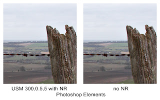
I've only used USM here. I have a couple of plug-ins but they only work on 8-bit images.

USM ART 300,0.5,5 was applied. this gave best overall visual results after some tweaking. Noise reduction using Neat Image and then Dust & Scratches (RT 1,40). the USM has left some speckling across the fields and the sky. Noise reduction has reduced the effect but also appears slightly softer.

Applying NR takes quite a bit of time - Neat Image has the control but thus needs more time for optimal results.

Lightzone 2.4

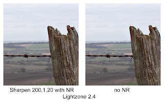
My everyday editing tool.

I used the Sharpen tool at ART 200,1,20. It works slightly differently than PSE, so different settings are required.

Lots of speckling introduced, especially in the sky - while I could mask it out, it isn't always practical and becomes hard to avoid a smooth/speckly interface zone.. Noise reduction helps but removes some detail too. I find Lightzone 2.4 OK for smaller prints and web display but not so good for larger stuff or finely detailed images.

Lightzone 3.2

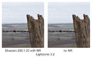
This is the current version which I use for specific images (especially for shadow recovery).

As to sharpening, gain ART 200,1,20 but this time using a luminance mask (the Zone masking built in to the Sharpen tool). This way I could mask out the sky and the dark areas, especially on the fence post but keep the edges. A much better result than 2.4, far fewer artefacts. NR was then applied to just the fields in the lower left corner. Very good overall result, I think.

In both versions of Lightzone I use the Difference blend mode to control the masking.

Picture Window Pro 4

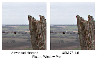
Current version and under evaluation by me.

I tried 2 sharpening methods - USM and the Advanced Sharpening. USM has much different range than PSE or Lightzone, here I use ART 75%,1,5. Very nice results, far better, I think, than PSE or Lightzone. Don't really need noise reduction.

For the Advanced Sharpen there are 3 parts to the tool. Noise reduction is a subtle grain removal tool (from what I can tell), I actually didn't use any here. There is then a Speck removal tool which takes out small speckles that might get sharpened otherwise (I would normally remove these after sharpening, here it is before). I use a very slight amount, reducing both light and dark specks.

Last is the sharpening but with very different controls. It has a sort of luminance masking similar to Lightzone 3.2 but also is far more effective at finding the edges (there is a mask preview available). There are then radius and amount sliders - I use R,A 1, 120%. The result I present here is somewhat over-sharpened but shows that PWP can go further in sharpening, leave detail intact and still not introduce extra problems. It is also fast and easy to use at this level of optimisation. Given that I've only been using it 2 days, I'm getting better results that PSE or Lightzone in a similar amount of time. I'd expect to get faster with practice.

I also like the level of control given and the ability to see the masking for each of the 3 steps of advanced sharpening.

With these results, it's almost worth buying PWP for the sharpening capabilities alone. Very impressive.

The essence of Wiltshire

Rolling fields, Avebury, December 2007

As I've mentioned before, I'm putting together a series on the landscape of Wiltshire, the area in which I grew up and still regard as home. It is a beautiful and historic area of the country but one that is too little known, I feel.

Wiltshire is associated most with 3 aspects:
1. Agriculture an the typically English rolling green countryside. Farming has been , and remains, a major part of the local economy. Farming has been taking place in this area pretty much since the birth of agriculture.
2. Historic sites, the really old stuff. Avebury and Stonehenge are the most well-known but the whole county is peppered with tumuli, long barrows and hill forts (e.g. Bratton Camp just a few minutes from my parents'). Stonehenge is modern architecture compared to some of the other sites, the stone circle being only 4000 years old.
3. The railways, notably Brunel's Great Western based from Swindon.

I am mainly concerned with the first two aspects, I've never really been a big fan of the railways, except to travel on.

The key is getting good images that reflect the beauty and age of the area without the distractions of modern development, major roads new houses etc. For example, one area I would have loved to include was the series of fields behind my parents' house. As a kid they seemed to go on forever, with the stream to jump, gates to scale and trees to climb. Unfortunately they are now the site of 1000 new homes.

Another drawback is the fickle weather - this is one of the wettest and windiest parts of the country.

I'll be posting my early attempts over the next few days but I'm really treating this as a scouting exercise to help guide me. In the end I hope to have about 20 finished images, including a few large format shots (so that I can print large and hang on my walls).

Friday 4 January 2008

Capturing the essence

Footpath gates, Wiltshire, December 2007

Yesterday, I mentioned my disappointment with the photography I was able to do while I was home for the Christmas vacation. There were 2 main reasons for this.

First the weather. Typical of Christmas in the West of England it was dreary and overcast much of the time. When there was a slight clearing in the sky it was accompanied by high winds. These conditions do not lend themselves well to photography, I find. Flat skies, flatter light. Even in the middle of the day my autofocus was having trouble locking on due to the generally low contrast. I did try to make the best of the conditions, however.

Secondly is the problem of capturing the essence of my mind's eye. I want to put together a series on my home area, around the countryside of Wiltshire. I'll post more on what I'm trying to do with this series at another time but the problem I have is the landscape as I perceive it and remember it is not quite what the camera sees. Too many roads and cars and new buildings. I think i need to get out my walking boots and get further from civilization. It's not that I don't know these areas well, just that the mind has a tendency to block out the unsightly bits, which the camera sees all too well.

Thursday 3 January 2008

Happy New(ish) Year

OK, it's a few days into the New Year but I'm just back from my Christmas break.

I've come back physically and mentally refreshed. I'm currently reading through the backlog of blog posts from my favourites. Some interesting stuff already. Got a nice mention from Paul Butzi, too - it's good to know that someone out there appreciates your efforts. For my part, reading his blog also helps trigger the synapses, leading to quite a few of my posts.

As to photography while I was away, not so good. i got out for a couple of days but it was disappointing. I'll be posting more on that later - for now I have to upload the shots I did take and see if the results are as bad as I expect. The effort won't be wasted, however, as I can also view it as scouting for later efforts.